Probability & Statistics
Probability Density Function
The CDF of a continuous random variable denoted is the function:
The PDF of denoted is defined in relation to the CDF as:
While by itself is not a probability (it can be greater than 1), it can have useful information about the probability. Take a look at the following equation:
The intuition for PDFs is that you can think of the PDF value at any point as the probability that will be in a small neighborhood of the point relative to the size of that interval . Hence why it is also called the density of random variable, as the random variable is most likely to take on values where the probability is dense in that region.
Power Law
It is easy to get confused by "power" and "exponential" relationships. A power relationship has the variable in the base whereas an exponential relationship has the variable in the exponent .
The power law comes up quite a bit when it comes to discussing the scalability of AI performance (as well as its meaning in data vis). That's why it's important to understand the mathematics behind it, how to spot a power law, and what it really implies.
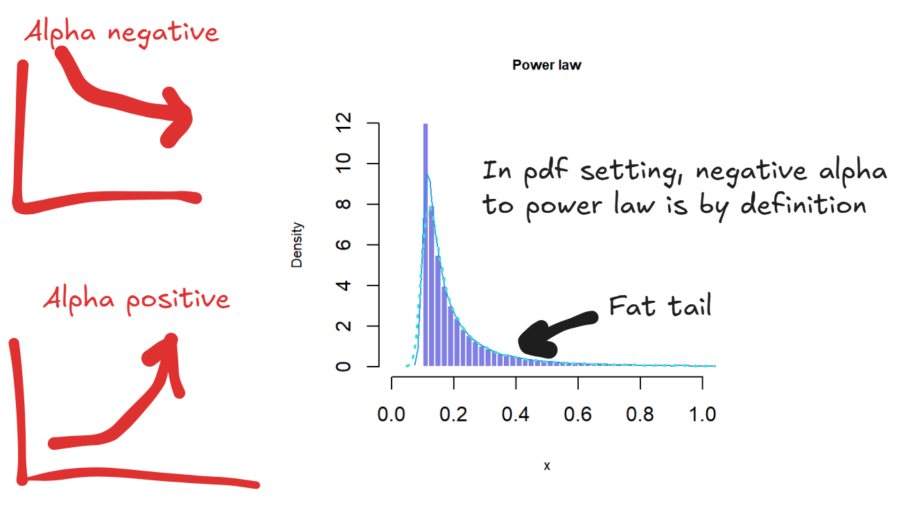
A power law defines the relationship between two quantities where one is proportional to a power of another, . A small change in can lead to a proportionally large change in . You can have positive alpha for explosive growth or negative alpha for inverse shrinking.
One attribute of power law is scale invariance where . Scaling by results in in the . Consequently, the distribution or relationship looks the same regardless of the scale you use.
Power Law Distribution
A power law distribution is one where the probability of an event is proportional to the power of the magnitude of the event, so where . Note that the convention is for a negative alpha because the probability decays as a power of . Compared to a normal distribution, a power law distribution has a fat tail so the probability of extreme events is higher than a normal distribution. An example is in the startup world where the unicorns dominate wealth creation and return on investment. The average case does not matter, because all the value comes from the tail.
AI Power Law
In the context of AI you have the power law relationship between loss and compute such that . On a log to log plot, it will be a straight line or linear relationship. But in actually loss quantities, the reduction is sublinear, isn't that bad? No - the inverse power law here means that you can always keep reducing the loss although the gains get less with the flattening of the curve. With more compute you will always get predictable linear gain in the log to log scale!
Log-Uniform Distribution
The reciprocal distribution also known as the log uniform distribution, is a continuous probability distribution, with the PDF defined as:
For and .
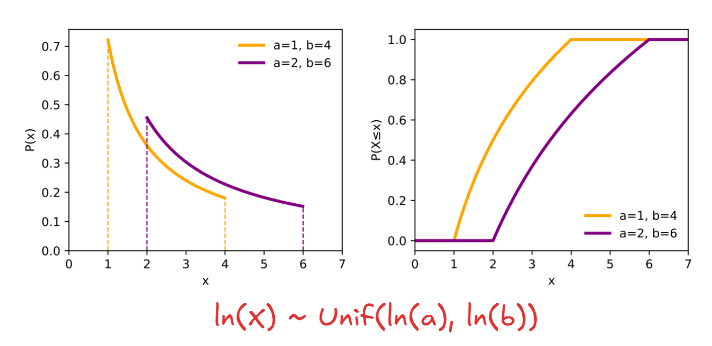
To best understand the log-uniform distribution, first start with the definition of the continuous uniform distribution. We say that is a uniform random variable on the interval denoted if its cumulative distribution function (CDF) is equal to:
The probability density function (PDF) for the uniform distribution is just the derivative :
The reason why it is called log-UNIFORM is that a positive random variable is log-uniformly distributed if the logarithm of is uniformly distributed between and :
To derive the formula for the log-uniform distribution, start with the CDF, which by definition should be uniform for the random variable from to :
Now we take the derivative to get:
IoU
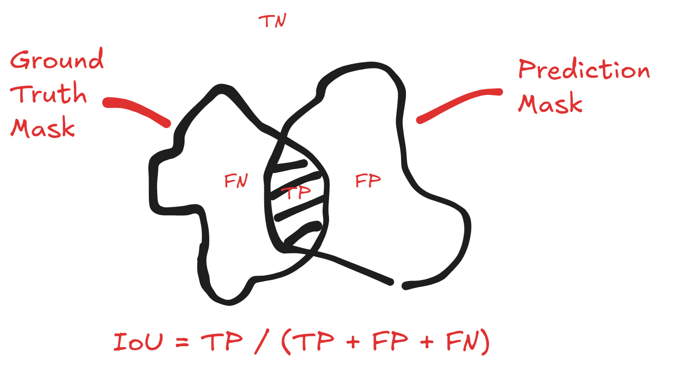
Intersection Over Union is a similarity metric commonly used in object detection model evaluation. The easiest way to think about it is that given a predicted area and ground truth area (i.e. a segmentation mask or bounding box), it is calculated by dividing the area of the intersection with the union of the areas. The resulting value of 0 indicates no overlap, and 1 as perfect overlap.
With binary classification, it can be written as:
or in set notation:
Here's an easy visualization of how the set and the binary classification definitions are equivalent:
F1 Score
One thing I recently looked deeper into (as part of my flood mapping project) was the math behind the F1 score. I have always known that it was the "harmonic" mean of precision () and recall (), but did not know anything really beyond that.
First, let's define the "harmonic" mean mathematically. One thing to remember is that it is normally used for positive values, typically ratios and rates. For positive reals , it is defined as
It is also the reciprocal of the arithmetic mean of the reciprocals:
In the context of F1 as a value of precision and recall, we have that:
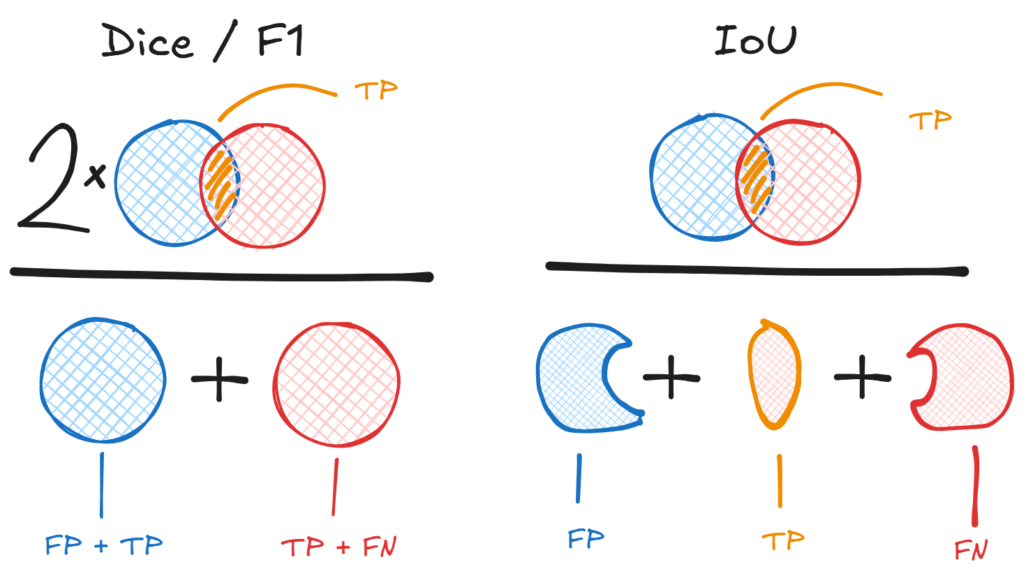
Another name for F1 score is Dice Similarity Coefficient or Dice Sorensen Coefficient (DSC). The Dice Coefficient for discrete sets and is equivalent to the above formulation and is defined:
Is IoU and F1 related?
It is also the case that the IoU / Jaccard () and the F1 / DSC () are linked mathematically. You can convert between the two using the following:
or
The harmonic mean has the property that it is always greater than or equal to the minimum of its values . The harmonic mean of a list of values however, tends to its least value as opposed to the arithmetic mean, and therefore is less susceptible to the impact of outliers. A good way of thinking about this is that we use arithmetic mean of the reciprocals to bias the small values in the same way, and we convert that effect back into our original unit by taking a reciprocal again. The reason why it is used over the arithmetic mean in the context of balancing recall and precision, is that it punishes imbalance more strongly. If you have high precision but low recall because you are too picky, F1 will be low. If you have high recall but low precision because you are overly sensitive, then F1 will also be low. F1 will only be high when both are high and in agreement.
The only drawback is that F1 treats recall and precision as equally important. In cases where recall is more important than precision or precision more than recall you want to use the F-beta score which is a generalization of F1 with weighted harmonic mean. Given ,
Observe that at the weighting is equal and it defaults to the normal F1. But if then recall is weighted twice as important and precision is weighted twice as important.
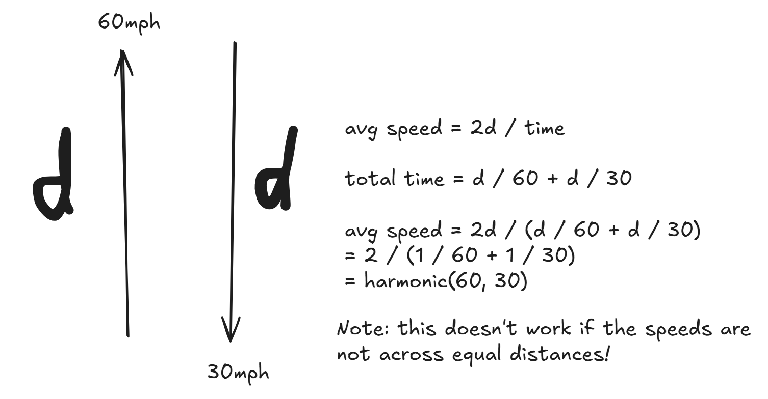
Harmonic means shows up in rates and ratios. Why? Suppose you drive a car 60mph for miles, and then return at 30mph for miles. What is the average speed? The average speed is NOT the arithmetic mean , because it assumes the same time elapsed between the two. Instead, it is the harmonic mean:
AUPRC
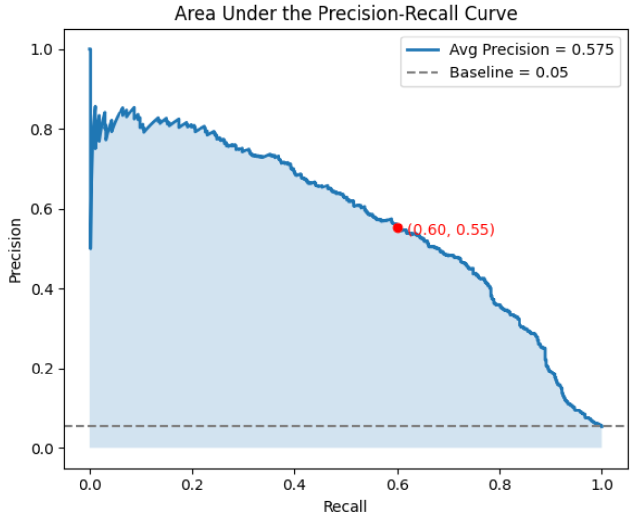
The metric AUPRC stands for the Area Under the Precision Recall Curve, and is a useful performance metric in addition to F1 score for capturing ability to predict positives in an imbalanced dataset. A perfect AUPRC means predicting all the positives correctly without any false positives. AUPRC also captures how the model performs at different thresholds - so it is fine grained at the level of probabilities (a model that has ambivalent probabilities will be distinguished from a model that is more confident), not just the actually binary outcomes!
To calculate AUPRC it is important to know about the Precision-Recall Curve, which shows tradeoff between precision and recall across different decision thresholds. As we change the classification threshold across a list of values we get a corresponding confusion matrix, precision, and recall for each, which we can plot as a point on the graph. We don't actually need to try every single probability threshold - for starters you can limit the thresholds to the discrete set of probability values in the model prediction, so if the model only predicts as probabilities, then you only need to check the two thresholds.
A good place to start conceptualizing this curve is the perfect case. A perfect AUPRC of corresponds to a square on the plot from (0, 1) recall + precision to (1, 1) to (1, 0).
# subtlety: while rec = 0/FN = 0, prec is undefined 0/0. Convention is prec=1 since no FP mistakes made (CAVEAT IN THE DETAIL BELOW!)
Threshold = 1 ==> all examples classified negative, so no FP and no TP: rec=0, prec=1 (see above)
# top right corner of square
0 < Threshold < 1 ==> all examples classified correctly, so no FP, FN: rec=1, prec=1
# bottom right corner (note it doesn't always end at prec=0)
Threshold = 0 ==> all examples classified positive, so no FN: rec=1, prec=0
Although you might think that the AUPRC curve should always start at the top left corner (rec=0, prec=1), it might not be in practice - it boils down to label of the example with the top predicted score. Remember: we start with threshold of 1 with everything labeled negatively and start lowering it so positive labels crop up. In practice, the very first positive prediction happens at the highest predicted score, i.e. the model's top ranked example say 0.99999. If the top scoring example is actually a positive ground truth, then we start from the top left corner (0, 1) artificial point and proceed to the first data point rec>0, prec=1. BUT if the top scoring example is negative, then the first positive label will contribute to the FP, so you have the first data point as rec=0, prec=0, resulting in the model starting from (0, 0).
Really (0, 0) is just an artifact added depending on certain cases for the plot to work.
Similarly the (1, 0) point is also an artifact added for plotting.
PR curves can be thought of as simply dependent on the ranking of the scores given to each example. Listing the scores from highest to lowest, you sweep down the list and recalculate the confusion matrix, precision, and recall at each step or cutoff.
A PR curve often ends at the lower right because at threshold of 0 the recall is perfect 1 but the precision is low.
The AUPRC is calculated as the area beneath the PR curve, which can be plotted on a graph with recall on the x-axis and precision on the y-axis ranging from 0 to 1. Observe that PR curves do not consider the number of true negatives due to the focus on precision and recall. As a result AUPRC is unaffected by imbalanced dataset classes with a large percentage of negative cases.
How do we interpret AUPRC? With AUPRC the baseline is equal to the fraction of positives among total cases. Here's why: say the classifier was no better at random guessing. If you have total examples, positive examples, the positive rate is . Your classifier would spit out a ranking (relevant to PR curve) of each example by probability score. If the classifer guesses, then the ranking is completely random, and for any cutoff with examples above it, there will be TP and FP, so the precision is always approximately . As for the recall, if you have negative predictions, it will be which is just the proportion of positive predictions changing linearly with the cutoff. This makes sense for recall, because at 50% threshold you've only captured 50% of the positive cases, and at 100% you've captured 100% of the positive cases. Integrating the PR curve, . Hence we get the baseline being the rate of positives. A class with 12% positives has 0.12 as the AUPRC baseline, so 0.40 AUPRC is considered good. A class with 98% positives and a 0.98 AUPRC is bad.

Why do we care about the tradeoff between recall and precision? With a decision threshold of 0.5 you might not be at the optimal threshold for recall and precision! Especially if the class distribution is imbalanced. If the positive instance is rare, you might need to lower the threshold to detect them and boost recall.
For my ML experiment, it is possible to keep using F1 at threshold as development time objective, but it is important to inspect the PR curve after and find the best threshold and its corresponding F1 score.
ROC-AUC
The Receiver Operating Characteristic (ROC) curve also represents model performance across thresholds. The curve shows the false positive rate (FPR) on the x-axis and the true positive rate (TPR) on the y-axis.
The true positive rate is just another name for recall, so , while the false positive rate is the proportion of all actual negatives incorrectly classified , aka the probability of false alarm. As a result, the curve bends from left to right (unlike the PR curve), where starting from very high threshold you start in the bottom left corner with no false positives, then as you lower the threshold to zero and classify everything as positive, the TPR and FPR goes to 100% with all false positives and no false negatives - to the top right corner.
The ROC-AUC or area under the ROC curve is the probability that the model, if randomly given a positive and negative example, will rank the positive higher than the negative, irrespective of what the actual threshold is. The ROC-AUC curve also helps you determine what you want in the tradeoff - if false positives are costly, choose a threshold point with lower FPR at the expense of some TPR. Conversely, if false negative is costly, you can also push toward higher TPR with higher FPR as well.

For a binary classifier with random guesses (e.g. a coin flip), the ROC-AUC is . Anything below that you are performing worse than chance.
The disadvantage of the ROC-AUC metric with respect to imbalanced datasets, is that it can be misleadingly high. For instance, say you have a very small number ~10 of positives cases in the dataset of 1000, so most of the data will be negative. You can have a naive model label the negatives well, so the FPR is always perfect at 0. You can also have a good recall so you guess the 10 positives correctly but do so with extremely low precision with 90 false positives. As a result the FPR is and the TPR is high , leading to a high ROC-AUC. Thus the problem is that ROC can look good in imbalanced datasets while hiding misclassification in the minority of cases. This is unlike the AUPRC which is unaffected by the total number of TN predictions and takes into account the precision which is more relevant when the minority class is rare.